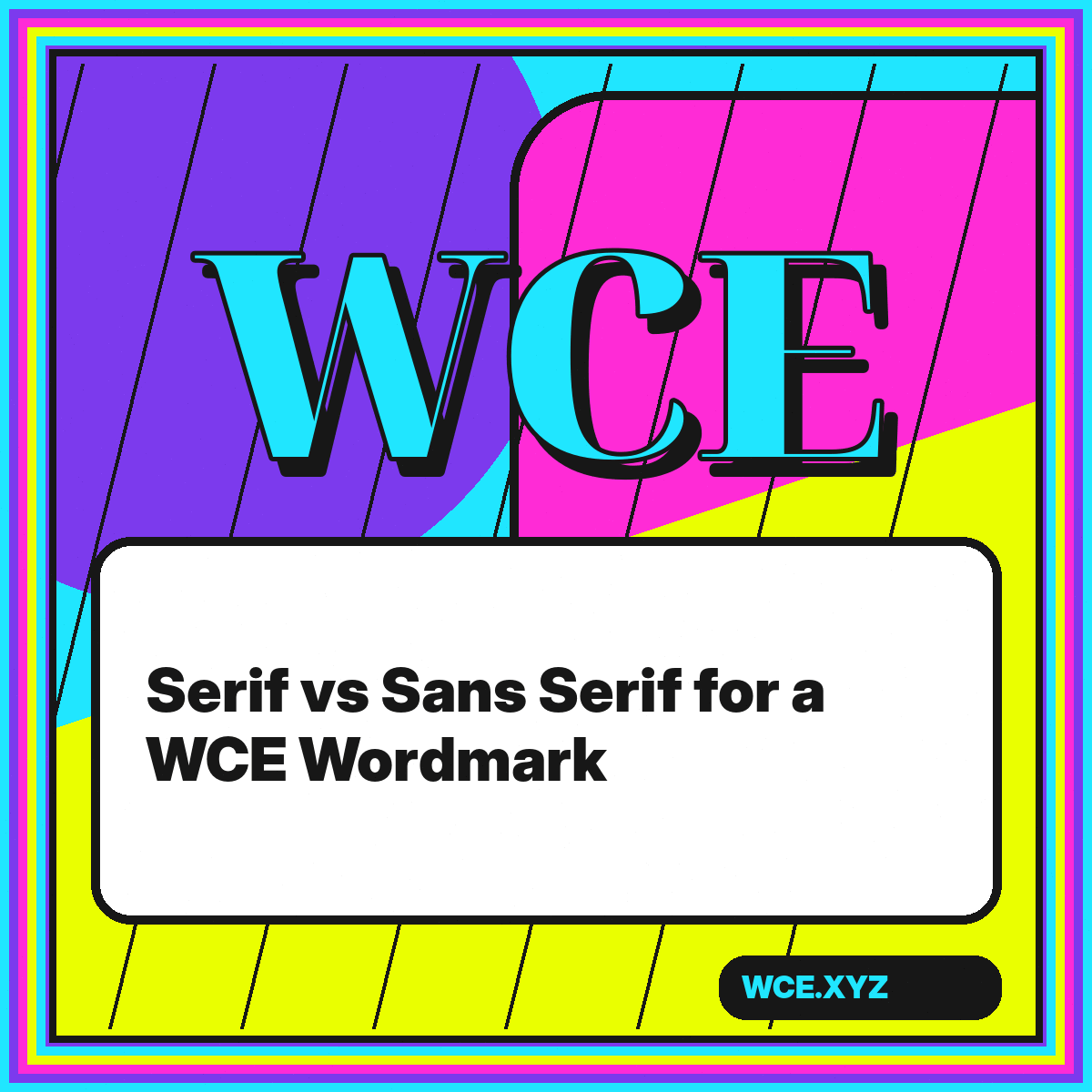
Choosing between serif and sans serif is not a vote on which category looks more modern. It is a decision about structure, voice, and how the three letters W, C, and E will relate at the sizes and in the environments that matter. A serif WCE can feel editorial, institutional, literary, luxurious, or deliberately historical. A sans serif WCE can feel direct, engineered, neutral, friendly, or aggressively contemporary. Neither category guarantees any of those qualities; the specific drawing and its treatment determine the result.
Because WCE contains a diagonal letter, a round letter, and a rectilinear letter, it is a useful stress test for type selection. The W reveals width and joint construction. The C reveals curve quality and aperture. The E reveals stroke contrast, terminal logic, and horizontal rhythm. Comparing those three shapes inside one wordmark makes the differences between type families easier to see than evaluating an alphabet specimen in the abstract.
Compare these principles with the WCE typographic logo showcase and WCE design process.
Start with the anatomy of the three letters
In a serif design, the W may have bracketed or unbracketed feet, the C may finish with pointed or wedge-shaped terminals, and the E may carry distinct horizontal serifs. Those additions create more edge activity and can strengthen the baseline. They also introduce more variables. If the serifs are delicate, they may disappear at small sizes. If they are heavy, they may crowd the already complex central joins of W. The category label alone does not tell you whether the wordmark will be quiet or ornate.
In a sans serif design, the absence of traditional serifs exposes the proportions more directly. A geometric sans may give C an almost perfect circular form and E a strict modular structure. A grotesque sans may use subtly uneven widths and a tighter aperture. A humanist sans may introduce calligraphic modulation. These differences influence personality just as strongly as the presence or absence of serifs. Evaluate the actual skeleton and terminals rather than assuming that all sans serifs communicate the same thing.
Compare the aperture and terminals
The opening of C is one of the most important details in WCE. A narrow aperture makes the letter feel compact but may close at small sizes. A wide aperture increases clarity and creates directional energy toward E. Look at how the C terminals align with the top and lower arms of E. When those elements share an angle or ending shape, the transition between letters can feel intentional. When they conflict, custom edits or wider spacing may be necessary.
Match the category to the communication task
A serif wordmark is useful when the brand benefits from visible authorship, cultural association, or a strong editorial voice. High-contrast serifs can make WCE feel refined and image-led, while slab serifs can make it feel robust and industrial. Old-style proportions can suggest warmth and tradition. The risk is that a dramatic serif family may bring more historical baggage than the brand intends. Ask whether that association is helpful in the actual context, not merely attractive on a mood board.
A sans serif wordmark is often easier to integrate into interfaces and technical systems because simple strokes remain clear across sizes. That does not make it automatically anonymous. Condensed sans forms can feel urgent, wide forms can feel calm, rounded forms can feel approachable, and neo-grotesque forms can feel controlled. The risk is choosing a popular neutral face and expecting the letters alone to become distinctive. A sans serif WCE usually needs careful spacing, proportion, or a custom structural gesture to avoid looking generic.
Separate brand voice from current fashion
Typography cycles through periods of popularity. High-contrast display serifs, soft geometric sans serifs, and ultra-condensed grotesques all move in and out of the foreground. A wordmark should be aware of those signals without depending on them. Test whether the choice still communicates the intended qualities when stripped of fashionable color, mockups, and animation. If the letterforms only feel convincing inside a particular visual trend, the identity may age as soon as that trend becomes familiar.
Evaluate spacing before judging personality
Default font spacing is designed for running text, not necessarily for a three-letter logo. W creates angled white space, C creates an open bowl, and E ends with a flat vertical edge. Equal numeric spacing between these letters rarely appears equal. Before rejecting a typeface, adjust the pairs individually. The WC pair may need to move closer because the diagonal of W leaves air. The CE pair may need a different relationship depending on how far the C terminals project toward E.
Serifs complicate this process because they occupy space beyond the main stems. In some families, the foot of W and the upper terminal of C nearly touch while the central white space still feels loose. In sans serifs, the problem may be the opposite: clean edges reveal every imbalance. Set the wordmark large, then reduce it and compare. Spacing that looks sophisticated at poster scale may merge at icon scale, while spacing that looks generous in a small header may feel disconnected on a wall.
Use optical alignment, not only bounding boxes
Software aligns the mathematical extents of glyphs, but the eye responds to mass. A round C usually overshoots flat alignment zones, and a pointed W may extend below the apparent baseline. Preserve those optical corrections when building a custom mark. If you convert the letters to outlines and force every point into a rigid rectangle, you may remove the adjustments that made the typeface feel balanced in the first place.
Test contrast, weight, and reproduction
High-contrast serifs can create a striking WCE at large size, but the thinnest hairlines may vanish in embroidery, vinyl cutting, low-resolution displays, or reversed applications. A monoline sans is more mechanically reliable, yet very light weights can also fail. Print the mark at small scale, simulate blur, and view it against both light and dark fields. The goal is not to eliminate subtlety; it is to know where a primary version needs reinforcement or where a simplified alternate is required.
Weight also affects internal balance. The diagonal strokes of W can appear lighter than the vertical spine of E, even when their measurements match. A serif family may compensate through stroke contrast, while a sans family may need a custom adjustment. Look at the wordmark as a silhouette. If one letter appears as a dark block and another dissolves, the family may not offer the right weights, or the mark may need outline editing beyond ordinary kerning.
Build a one-color proof early
Color can make weak letter relationships feel exciting. Remove it during evaluation. A one-color proof shows whether the shape, spacing, and hierarchy are doing enough work. It also reveals whether the serif or sans choice can survive legal documents, stamps, laser engraving, and other constrained applications. Once the one-color version is sound, color can amplify the personality instead of rescuing the construction.
Consider a hybrid rather than a binary choice
Some of the most distinctive WCE directions sit between standard categories. A flared sans can add terminal character without full serifs. A low-contrast serif can retain baseline authority while feeling contemporary. A sans skeleton can receive one custom wedge on C or E to create a signature detail. The important question is whether the hybrid feature supports the concept and repeats consistently. A single decorative addition that appears only once can look accidental rather than proprietary.
You can also use contrasting categories across a system without mixing them inside the primary logo. The WCE mark might use a compact sans while headlines use an expressive serif, or the reverse. This allows the logo to remain efficient while the wider identity carries more voice. Define the relationship through shared proportions, color, spacing, or terminal shapes. A typographic system feels coherent when different roles are coordinated, not when every element uses the same font.
Choose with a test matrix
Place the leading serif and sans candidates into the same matrix: browser header, square avatar, large poster, black-only document, reversed color field, and a paragraph of surrounding text. Score them against the brief rather than personal preference. Note legibility, distinctiveness, emotional fit, and production risk. The winning direction may not dominate every category, but it should perform best on the priorities that matter most to the brand.
The best category is the one that makes WCE more specific
Serif and sans serif are starting points, not final answers. The real choice concerns aperture, width, weight, terminal shape, contrast, spacing, and the associations those details create. WCE makes those decisions visible because its three letters contain such different structures. A good candidate lets those differences cooperate while preserving a clear silhouette.
Select the direction that meets the communication task, then customize only where the system needs it. Test the mark without color, at realistic sizes, and beside the content it will accompany. When the choice is grounded in use rather than fashion, either a serif or a sans serif WCE can become distinctive, durable, and unmistakably intentional.