Kerning WCE: Letter Spacing for a Three-Letter Logo
Learn how to space W, C, and E optically, diagnose uneven gaps, and build a repeatable kerning method for compact typographic logos.
Type selection, kerning, spacing, and letter anatomy for short WCE wordmarks where every gap is visible.
Learn how to space W, C, and E optically, diagnose uneven gaps, and build a repeatable kerning method for compact typographic logos.
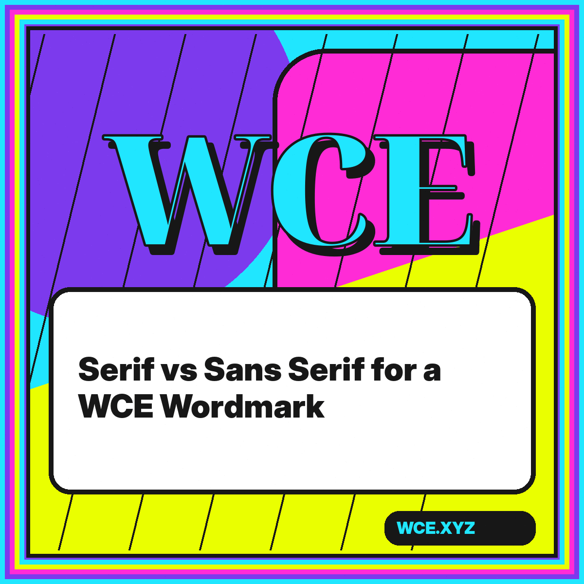
Compare serif and sans serif structures for WCE, including tone, spacing, scale, contrast, and the practical tests that reveal which direction fits a brand.
The WCE showcase keeps the letter sequence constant so the principles in this archive can be inspected across different styles.
Open the showcase →